S. OLENICH

50 best artworks. 6 different styles:
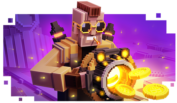
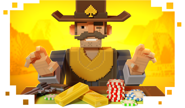
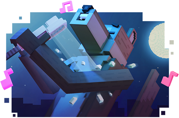
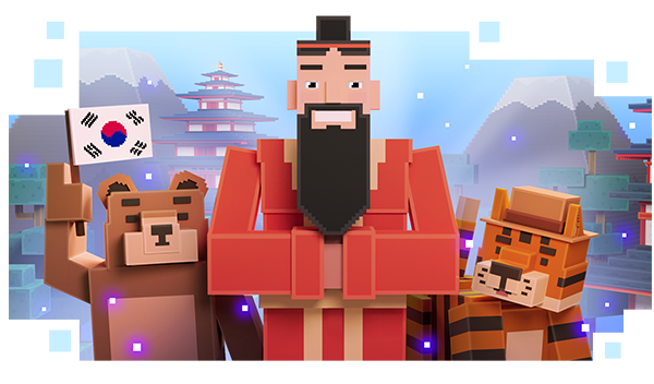
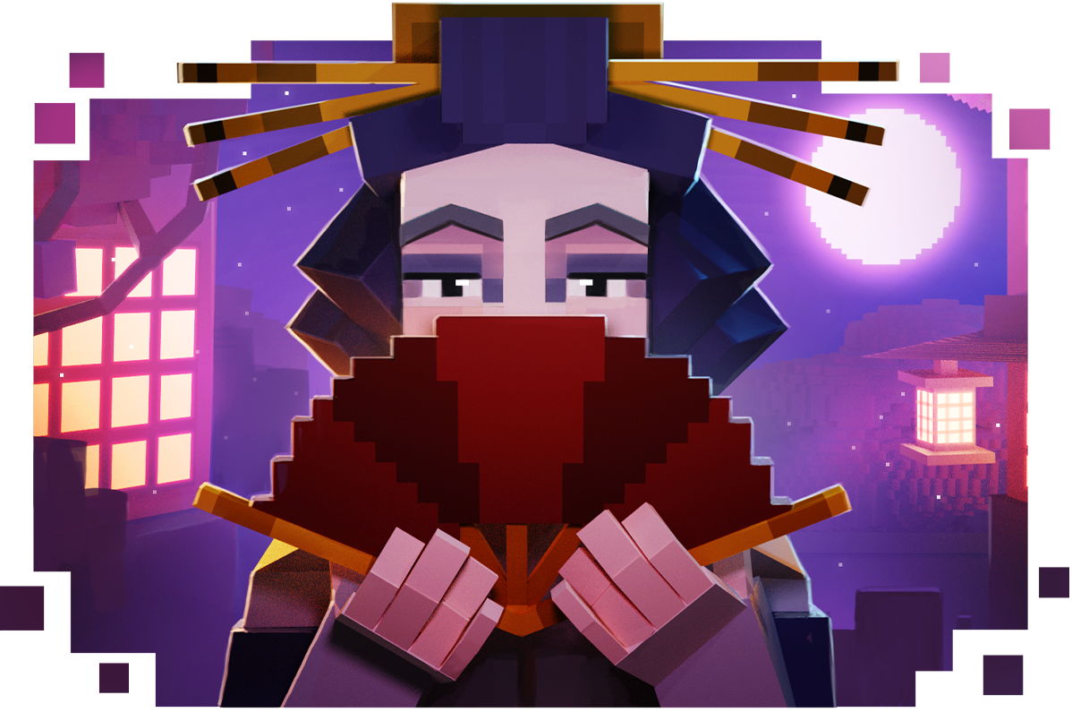
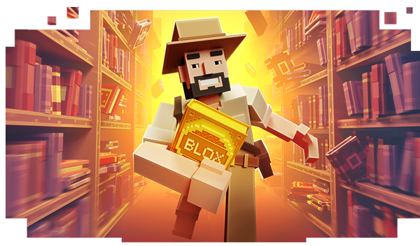
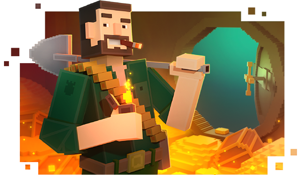
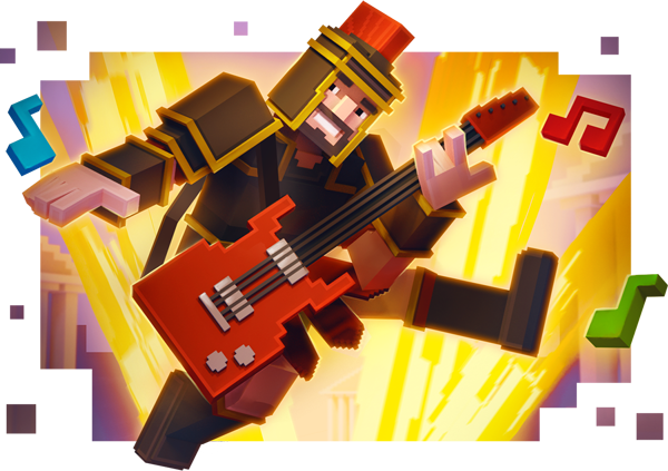
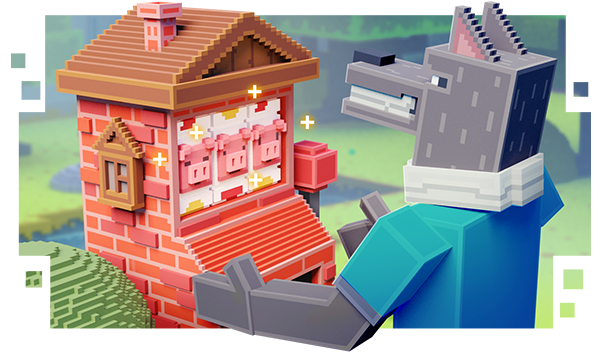
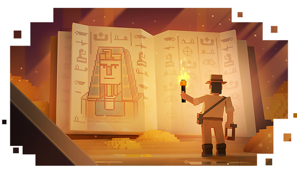
Voxel Style

Poly Vector Style

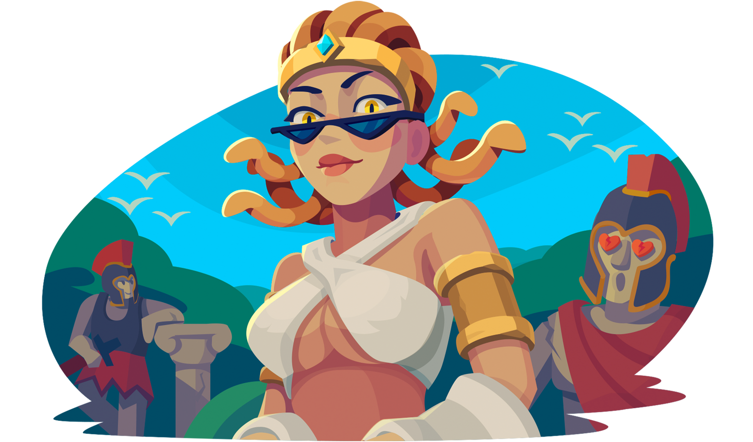
Cartoon Style


Paper Cutout Style


Midcore/ Casual Style


About me:
My name is Serhii Olenich.
Based in Lisbon, Portugal.
Art Director with 8+ years of professional experience and 10+ years of official education in visual arts.
My focus area for the past few years has been:
Marketing art (email marketing art, mascots, promo),
Managing outsource teams,
Mentoring junior artists.I am always curious and digging in principles of how things work. That way I find more efficient workflows. And systemize everything.
I am always communicating and making sure.
I prefer safe solutions. And go for a risk only if I have back-up plans or if cost of failure is insignificant.
I'm in arts not just for creating arts. My goal is not limited by creating nice pictures or even become top-tier famous artist. I want to make my life and life of people around me better. I aim to do meaningful impact locally and then globally. And use my skills for it.
Things that I find meaningful are: Honesty, Contribution, Gratitude, Courage, Mastery, Safety.
Highly prefer doing stylized colorful and kind arts :)
I am always open to meet new people.Would be glad if you contact me and say"Hi, Olenich :)"
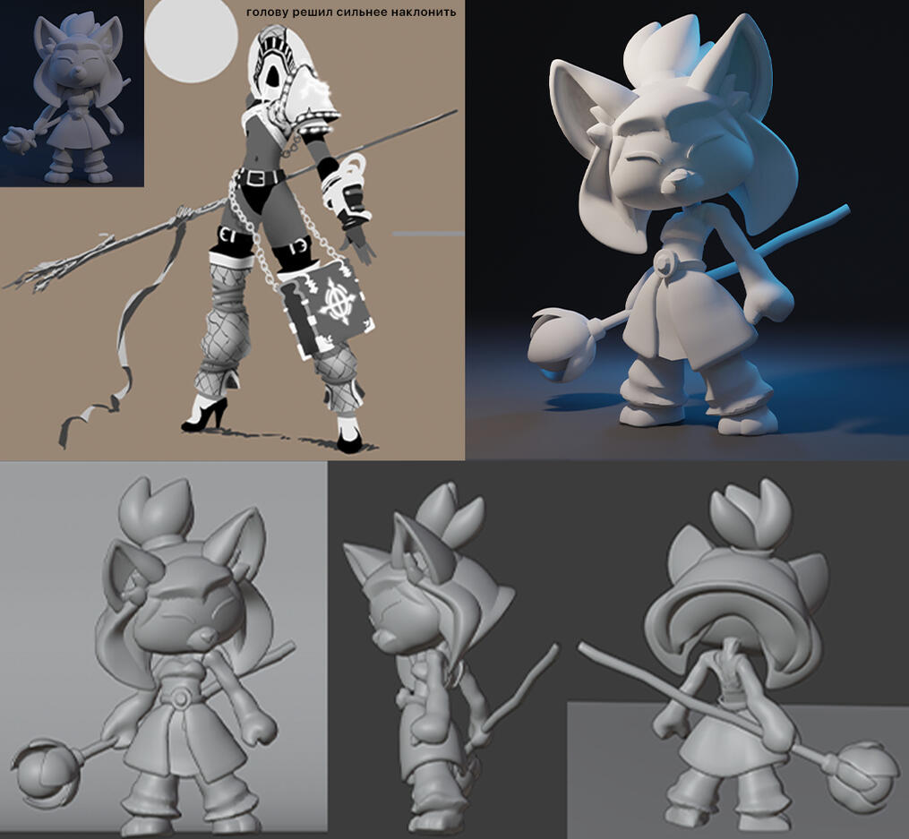
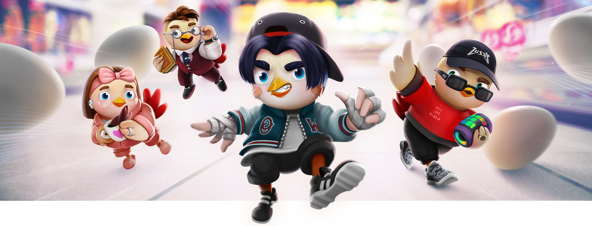
3D Mascot
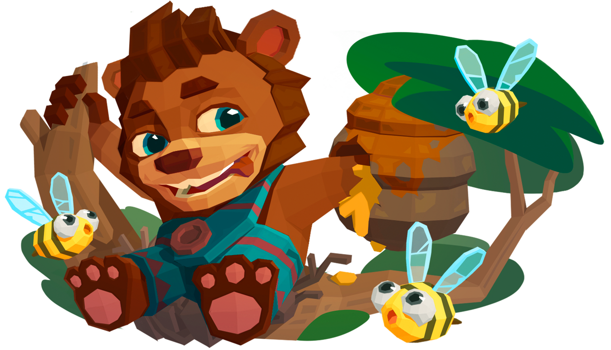
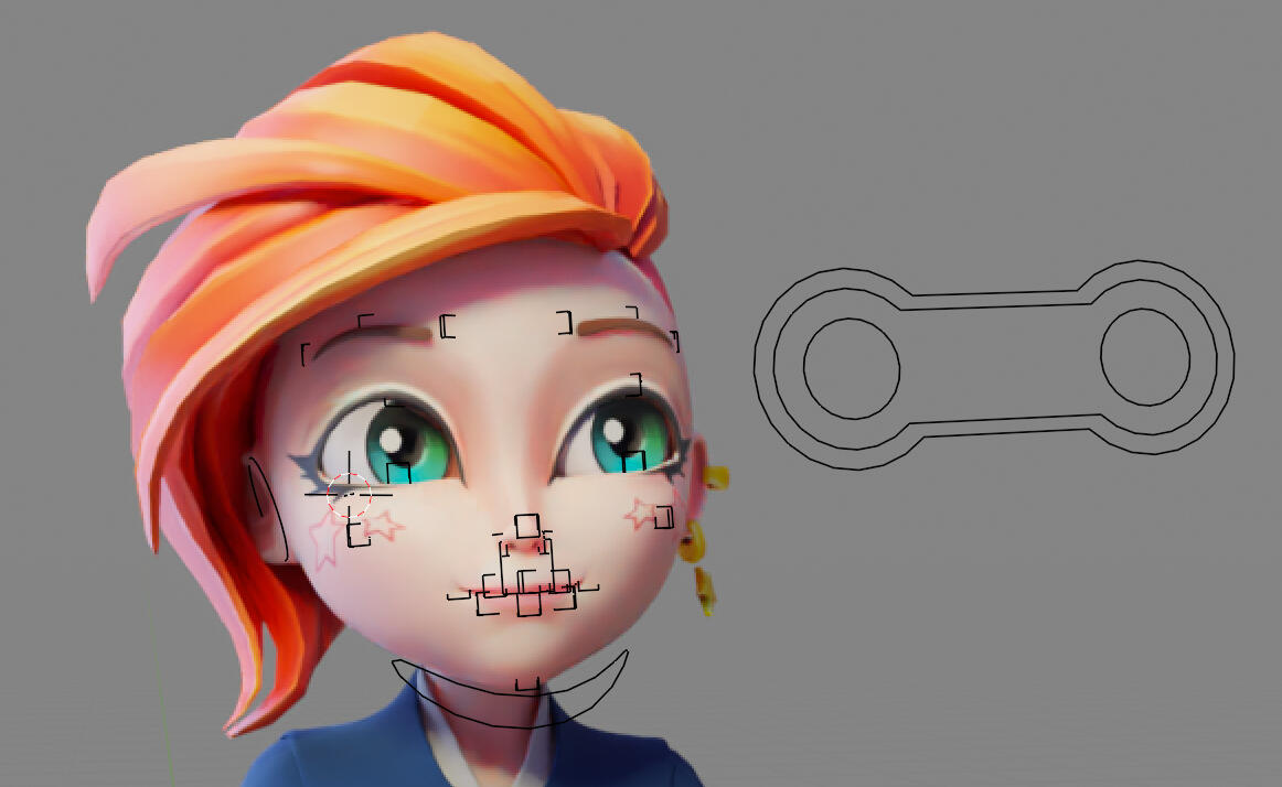
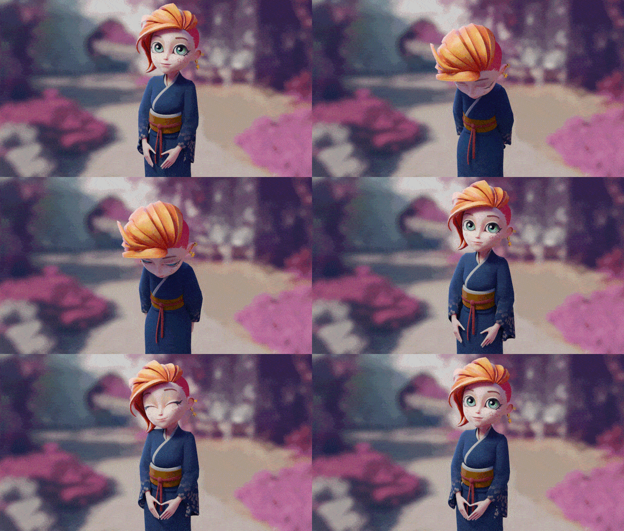
3D character for marketing materials. With themed costumes.
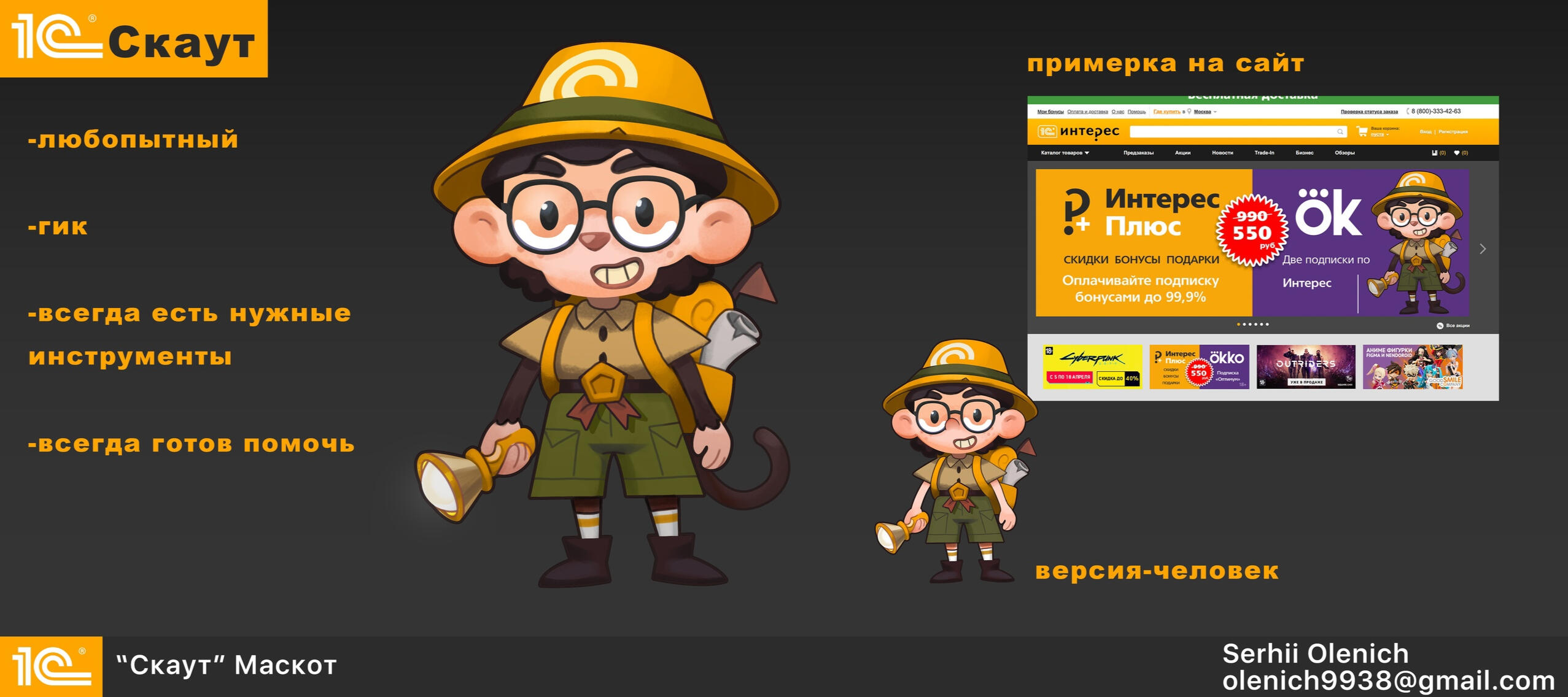
MAscot for 1c
1st place award at Mascot Contest for "1C Interes". Hosted by Smirnov School.
Kitten TeTRIS
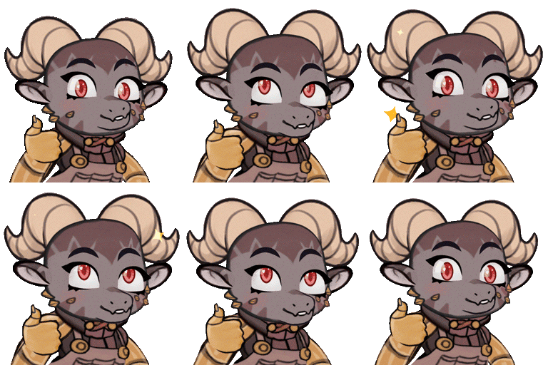
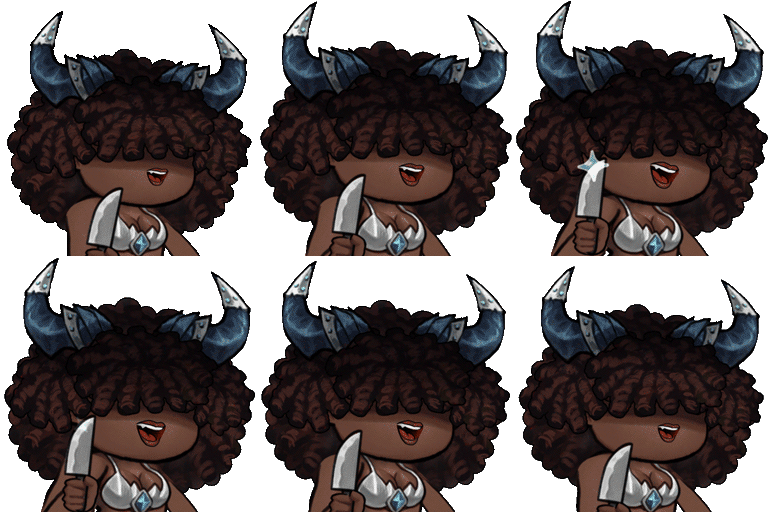
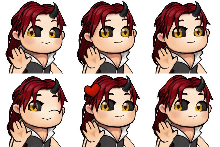
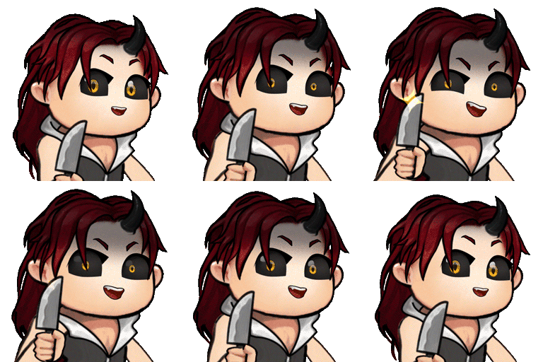
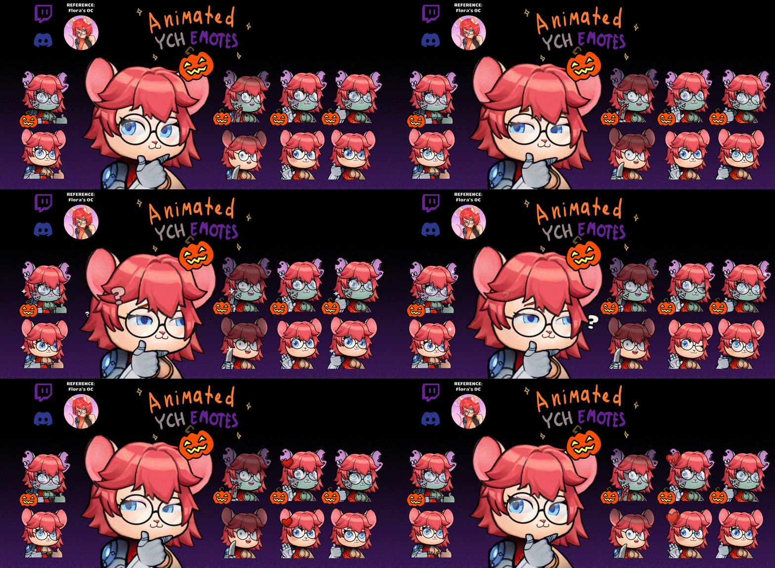
Emotes
Here are no projects yet. Come back later :)
Light STUDY
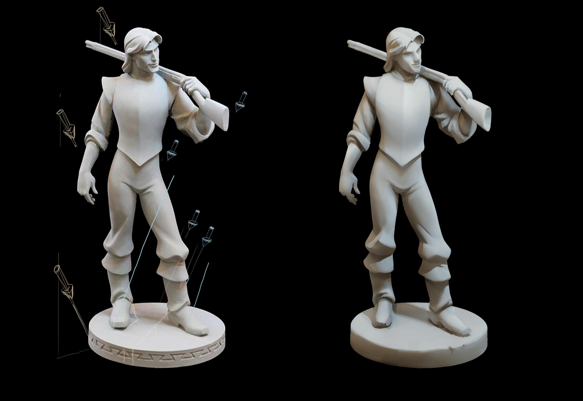
Tried to analyze, deconstruct components and recreate light situation in this study.

I've detected 2 light sources in the reference.
figured out by shadows their angle in 3d space.
and marked it with 3d arrows.
Then I created separate light passes for each of 2 light sources.To create Light Pass, I created "Direct Light" Pass. Where all shadow area after Terminator is flat black.To add "Indirect Light" and volume definition to shadows of the "Direct Light" Pass - I used Ambient Occlusion pass. But in Screen Mode. So that Indirect Light (Bounce light and Ambient Light) is not added where any light could not reach = AO zones.This way I usually create quick 3d-like renders. It is really very simple.
Just have to do 2 things correctly:
1. Place Terminator correctly and paint only half-tones in Light part next to terminator.
2. Draw AO as simple as you want and then add it in Screen Mode.You can see how effortless theese 2 layers are if you look at screenshot below.
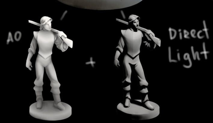
But notice how good they look combined.
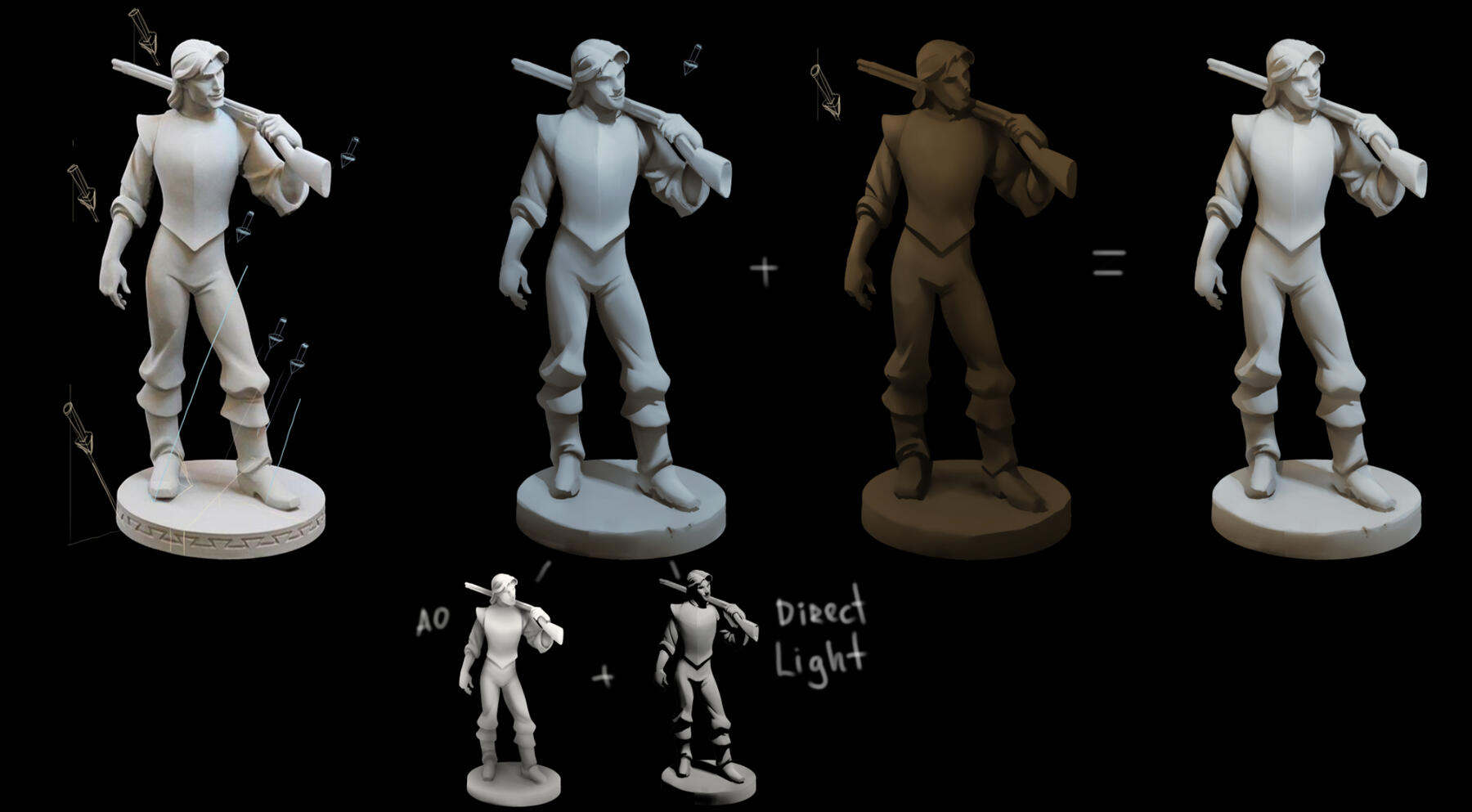
For the second warm Light Pass I created another "Direct Light" with flat shadows from other light source. And used the same AO layer to add Indirect Light.
I like how this white material figurine looks not just grayscale but with 2 differnt warm and cold lights, creating interesting cold-warm colors instead of lifeless gradient map or greyscale.
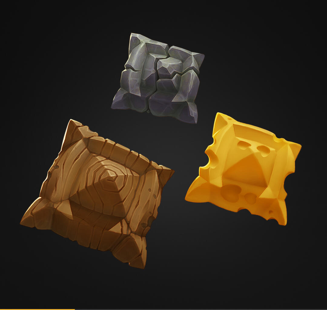
STYLIZED MATERIALS
Some stylized materials studies.
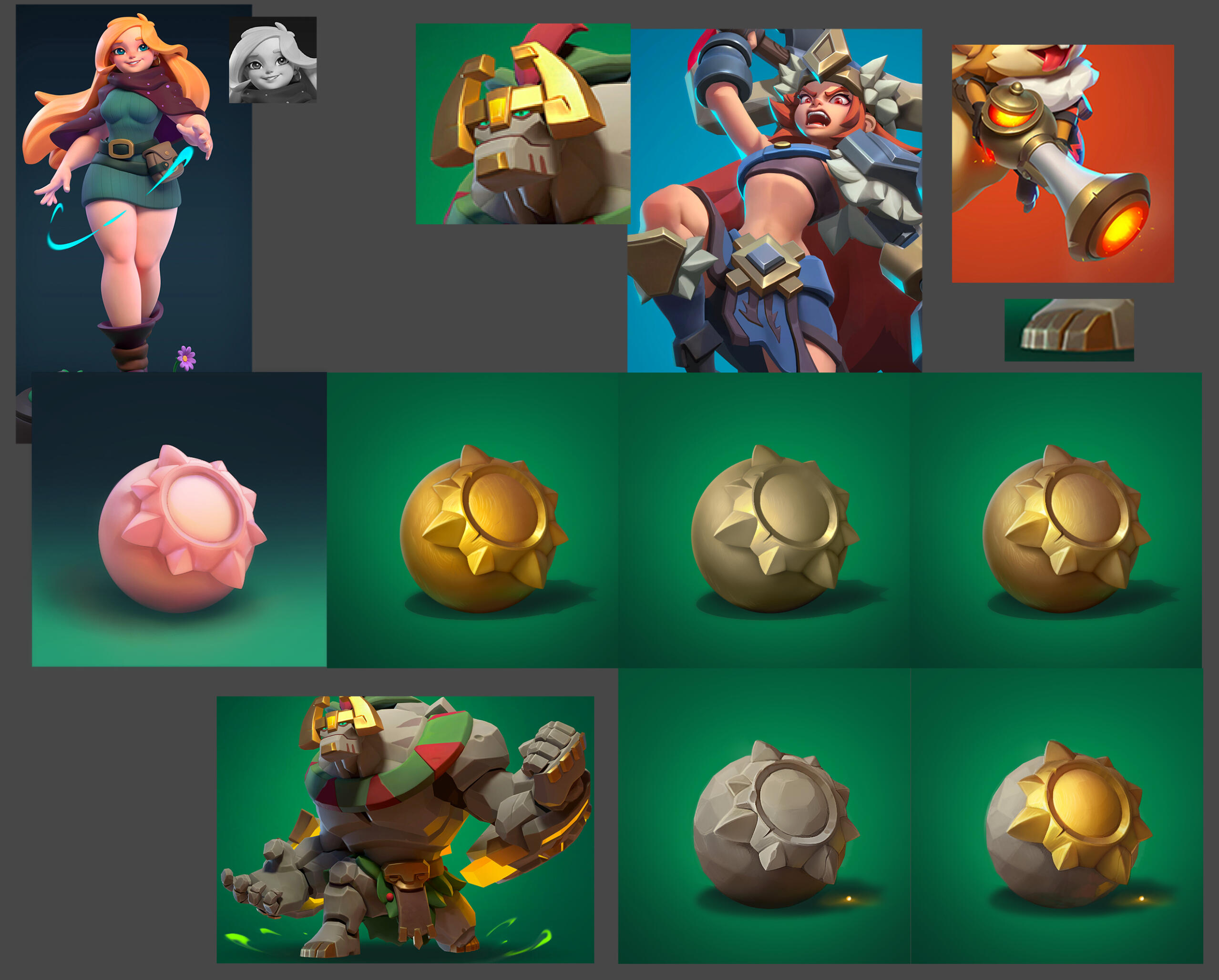
References above are from Chengyou Liu
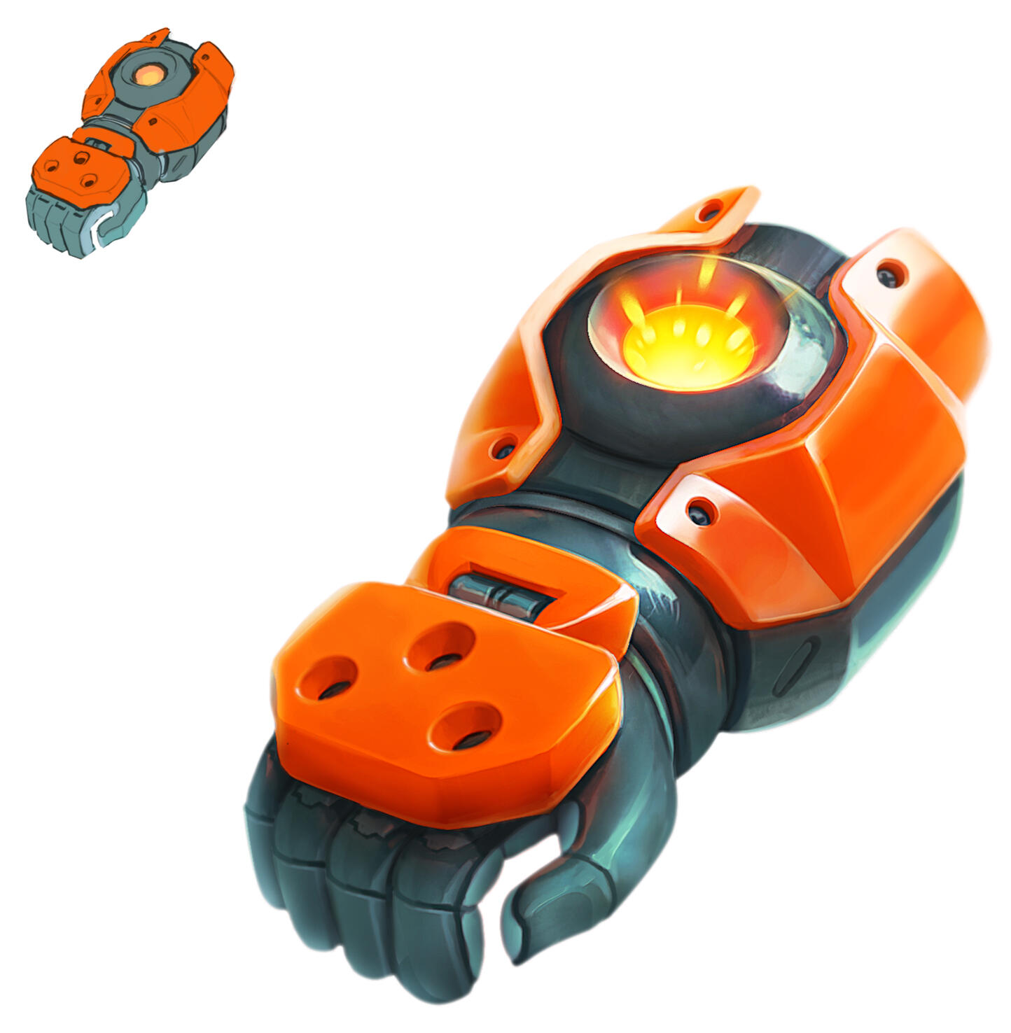
3D to 2d
3D to 2D WIP
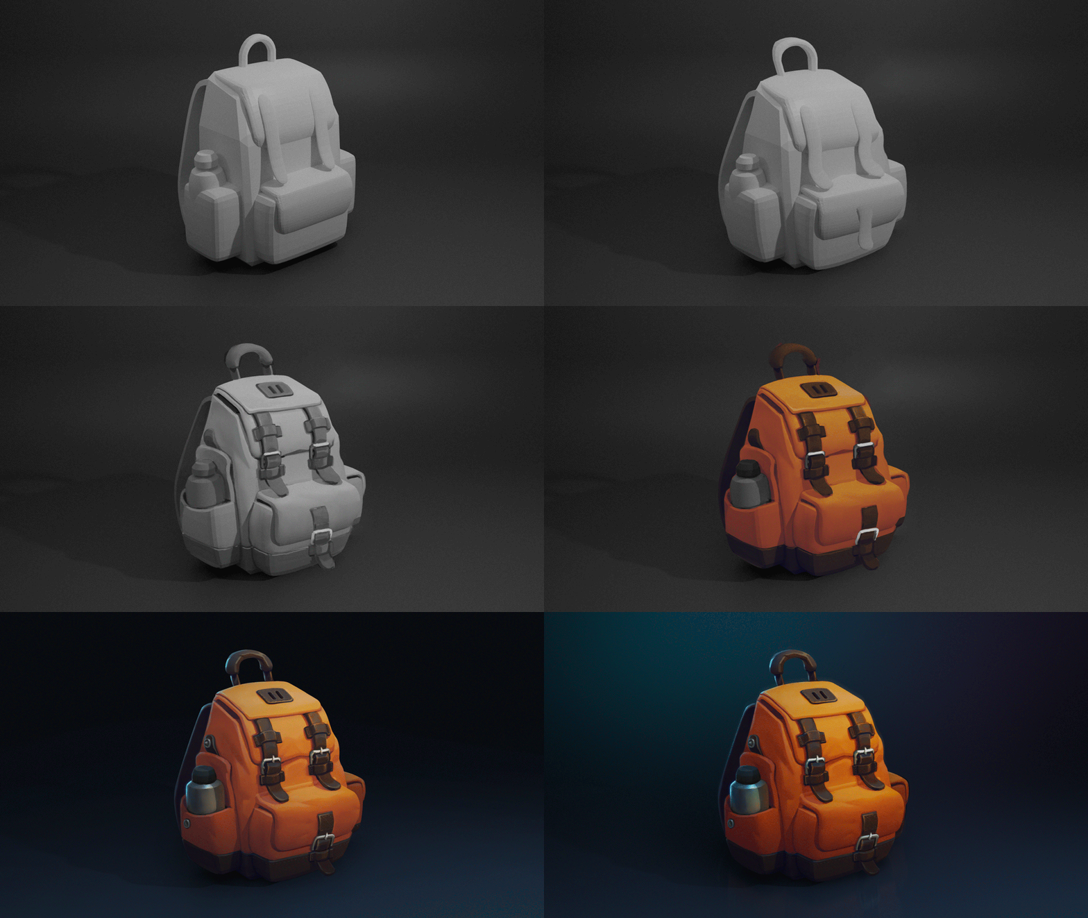
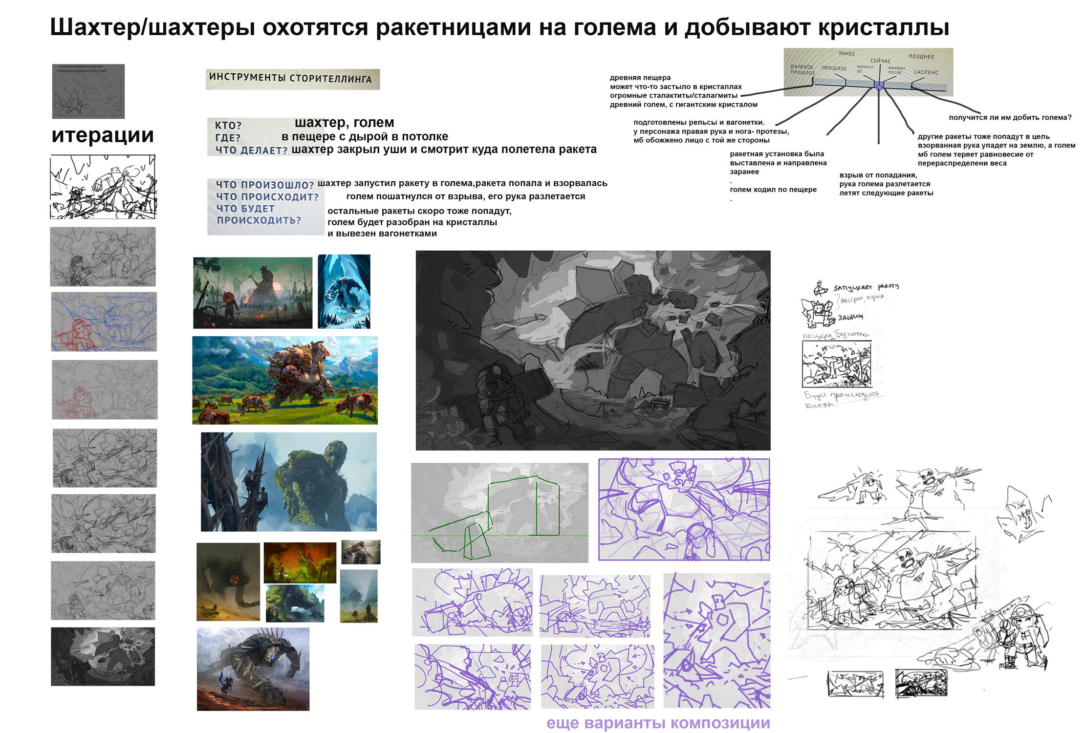
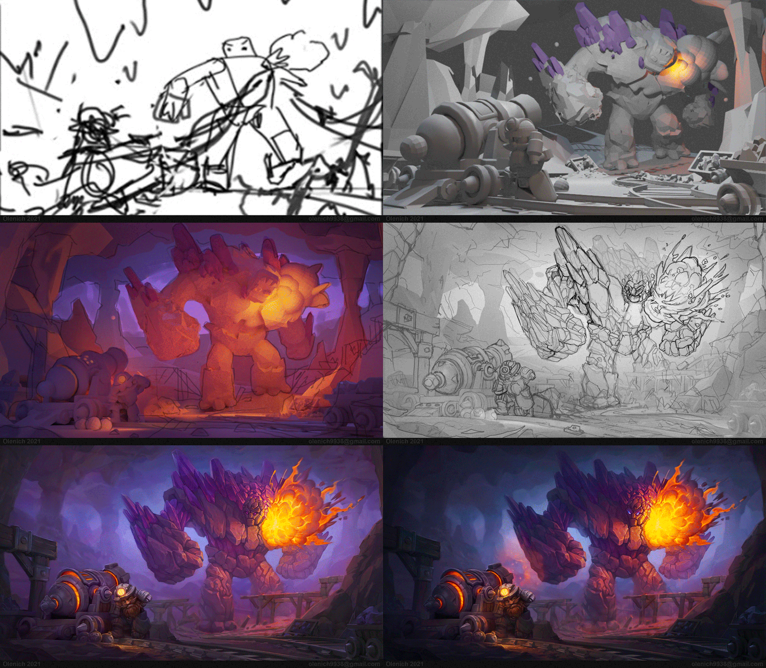
Illustration Development
Illustration development Process
3d Blockout Practice
Recreating concept as 3d blockout (reference - left) (my study - right)


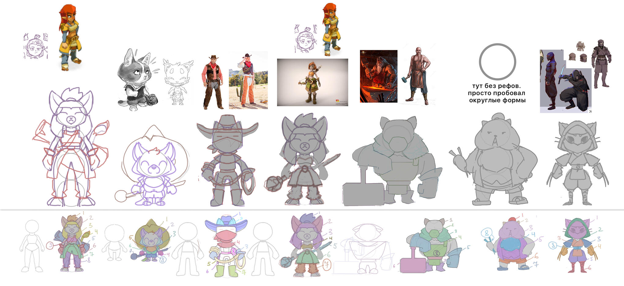
Limited number of shapes - eloquent character design and blockout practice
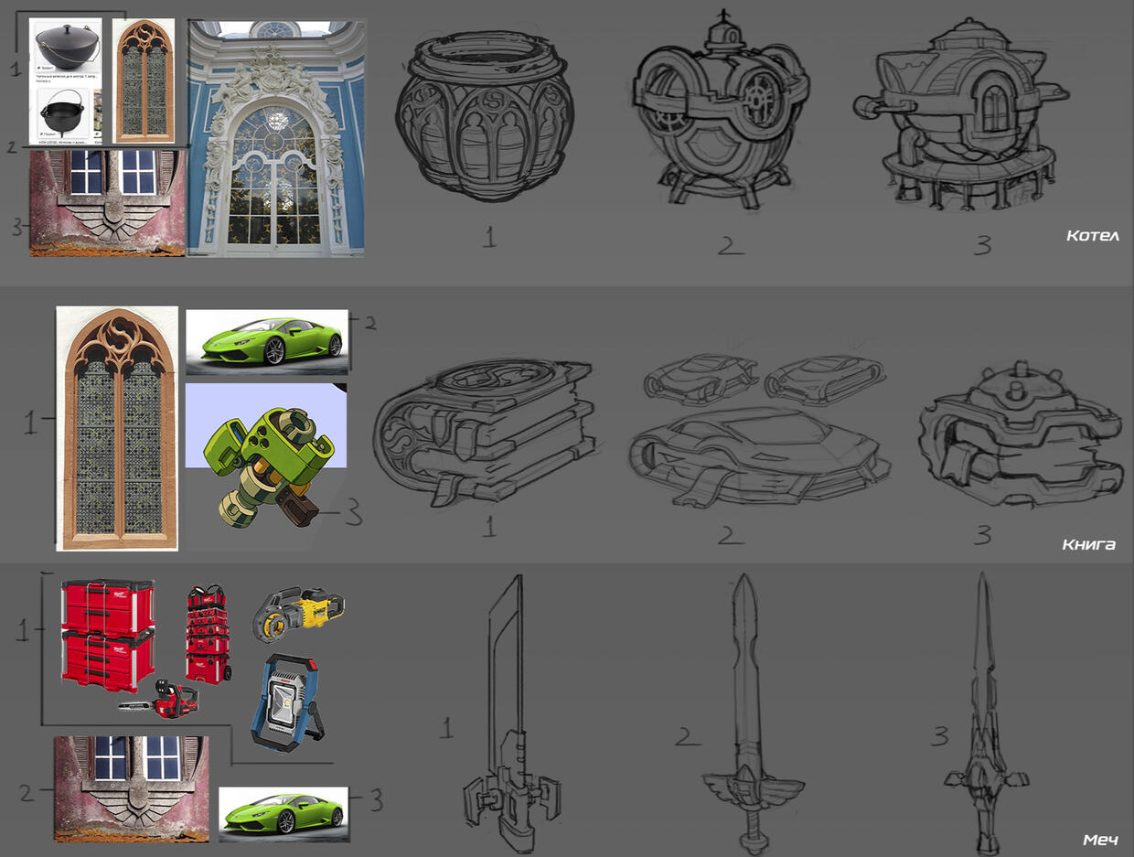
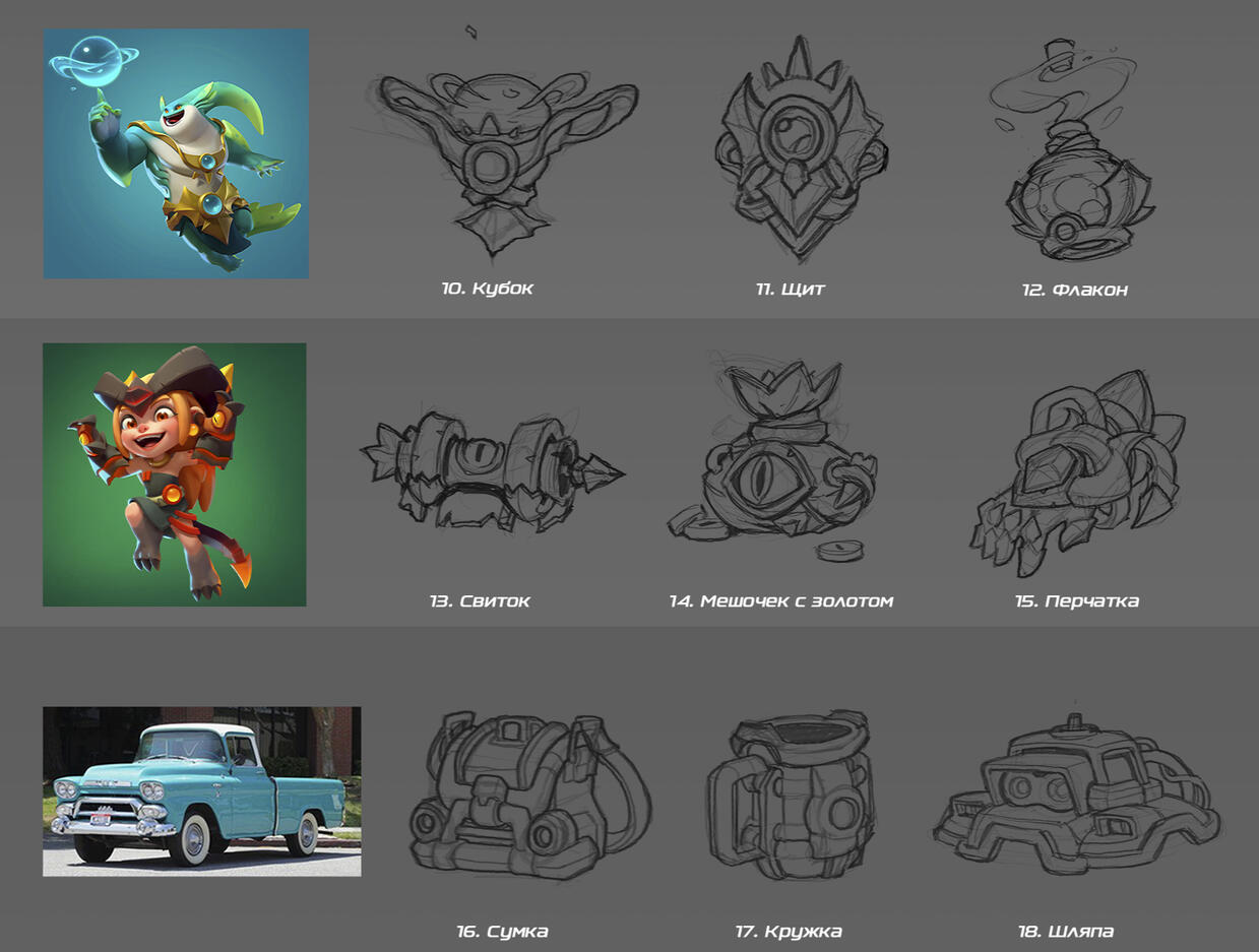
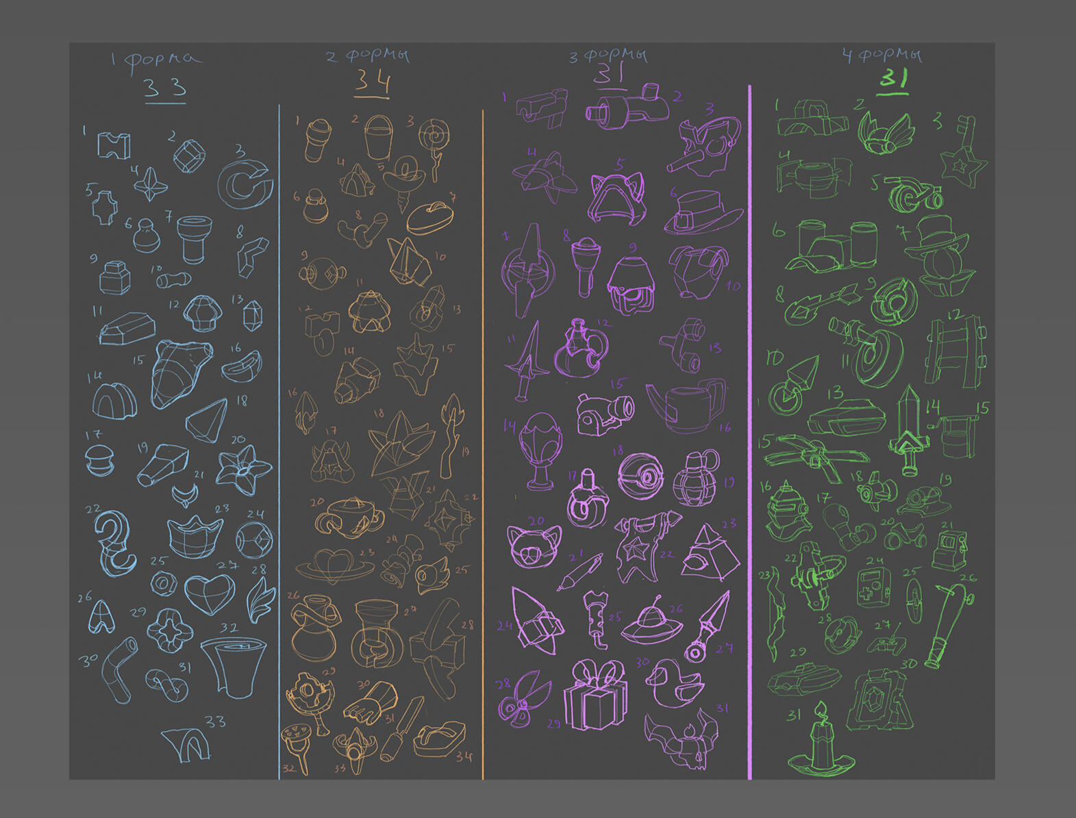
Shape Design Practice
Limited number of shapes (1,2,3,4 shapes) - imagination practice
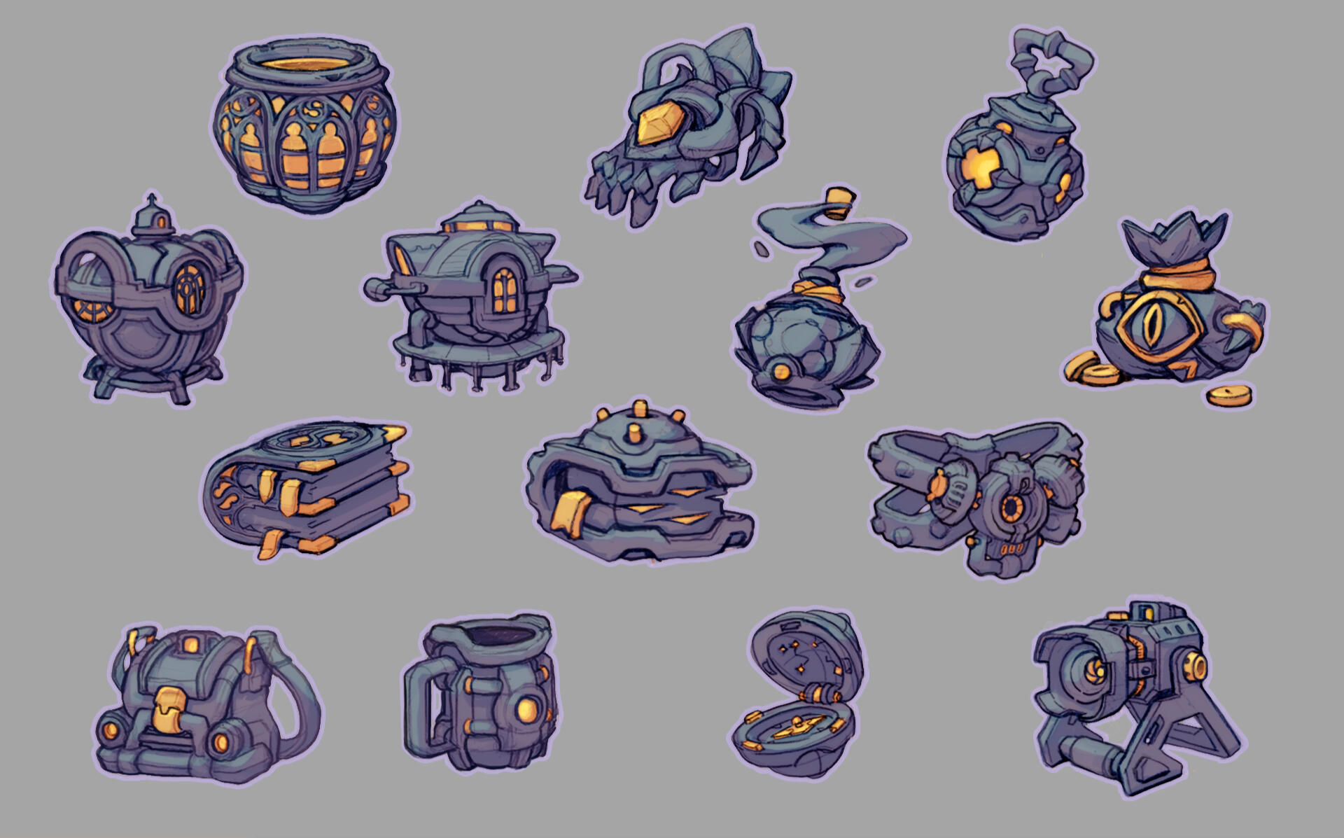
Transfering shape language practice
Here are no more studies yet. Come back later :)
I am always open to meet new people.Would be glad if you contact me and say"Hi, Olenich :)"
